
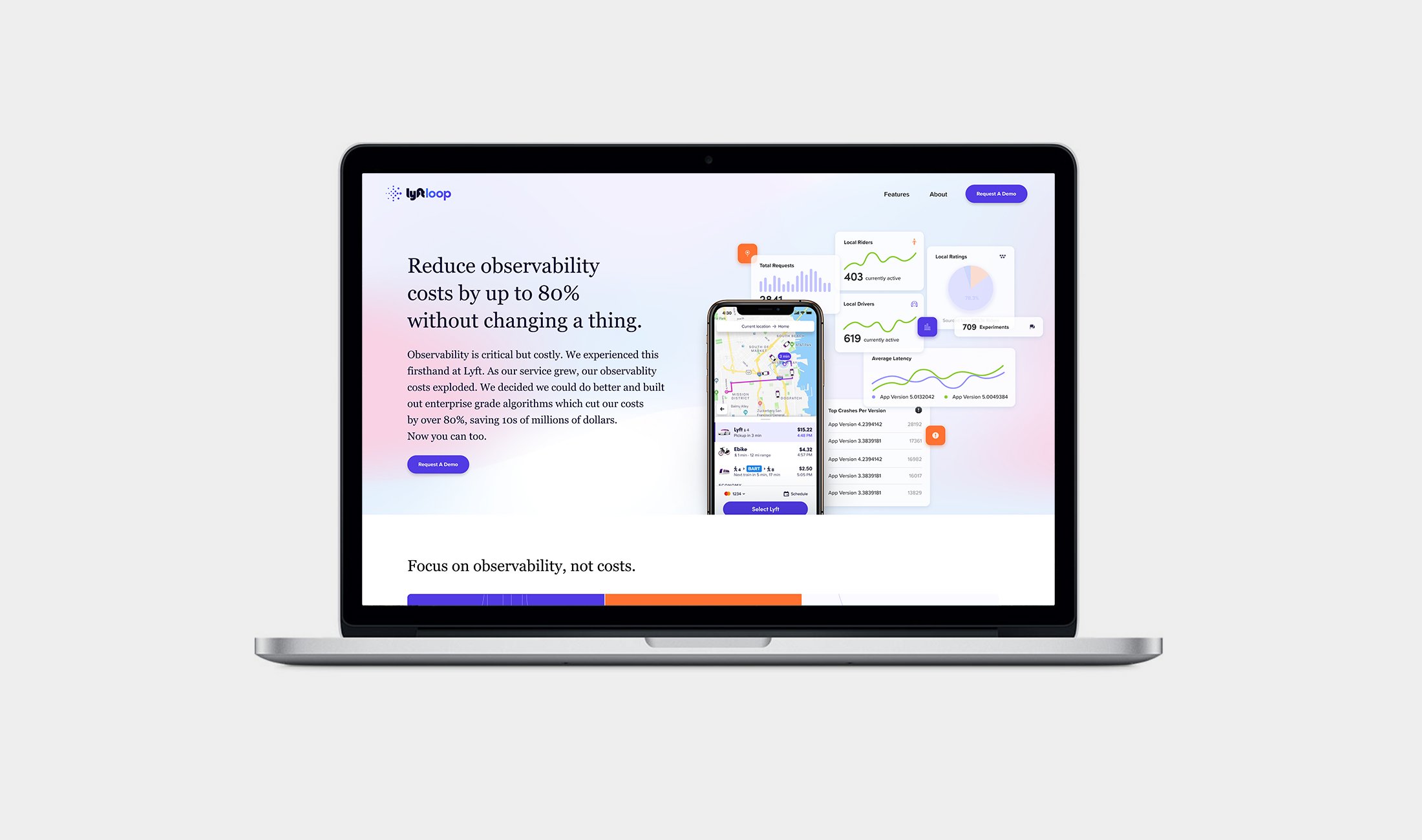

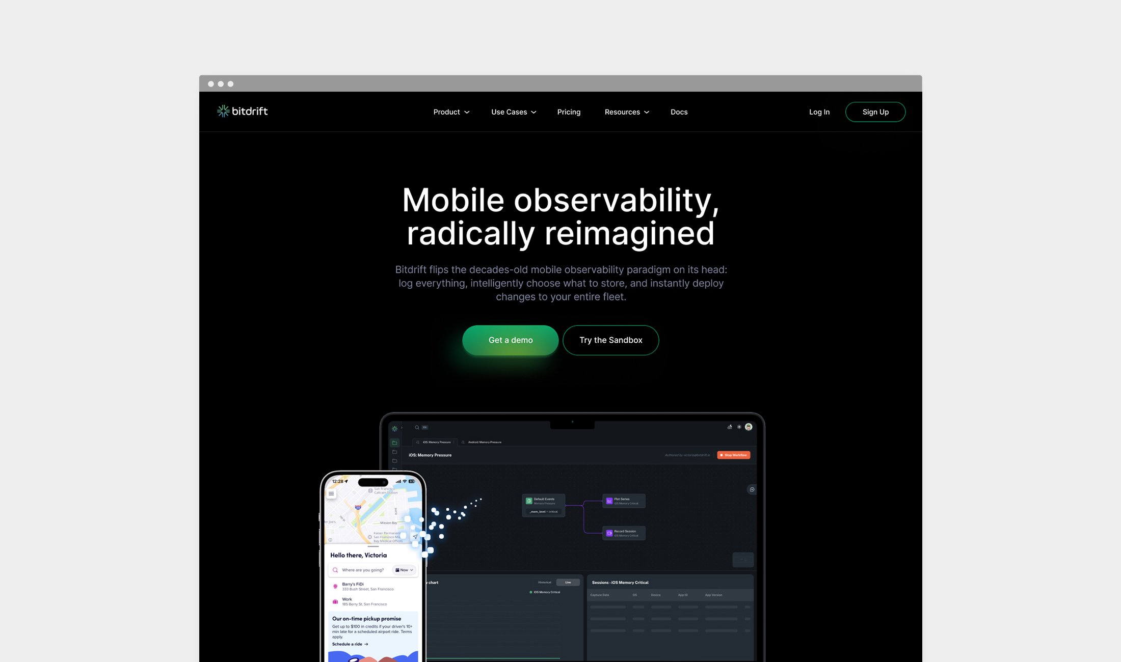


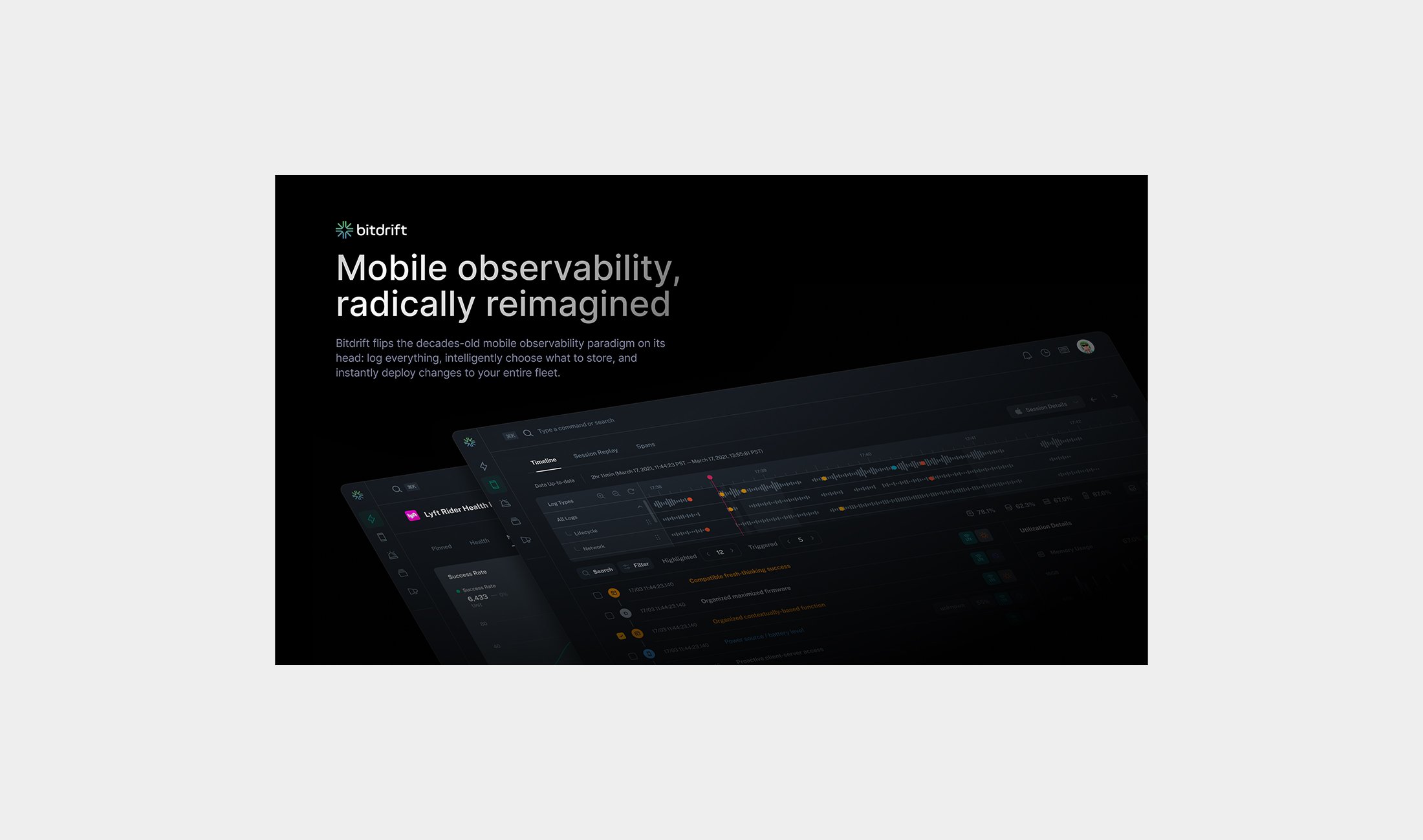

Bitdrift is a mobile observability platform that began at Lyft, evolved and spun out of Lyft into its own entity, and is currently revolutionizing the mobile industry with proprietary algorithms that reduce costs by 80% and design-led product innovation.
I've led Design at Bitdrift since day one, establishing a lean design process in close collaboration with our exceptionally talented Engineering team. Our design practice is structured into 3 core areas: Product Design, Sales & Marketing, and Branding. The following screens highlights the Branding, Sales, and Marketing initiatives I directed and oversaw as Design Lead at Bitdrift. If you'd like to explore my Product Design work at Bitdrift, please click here.
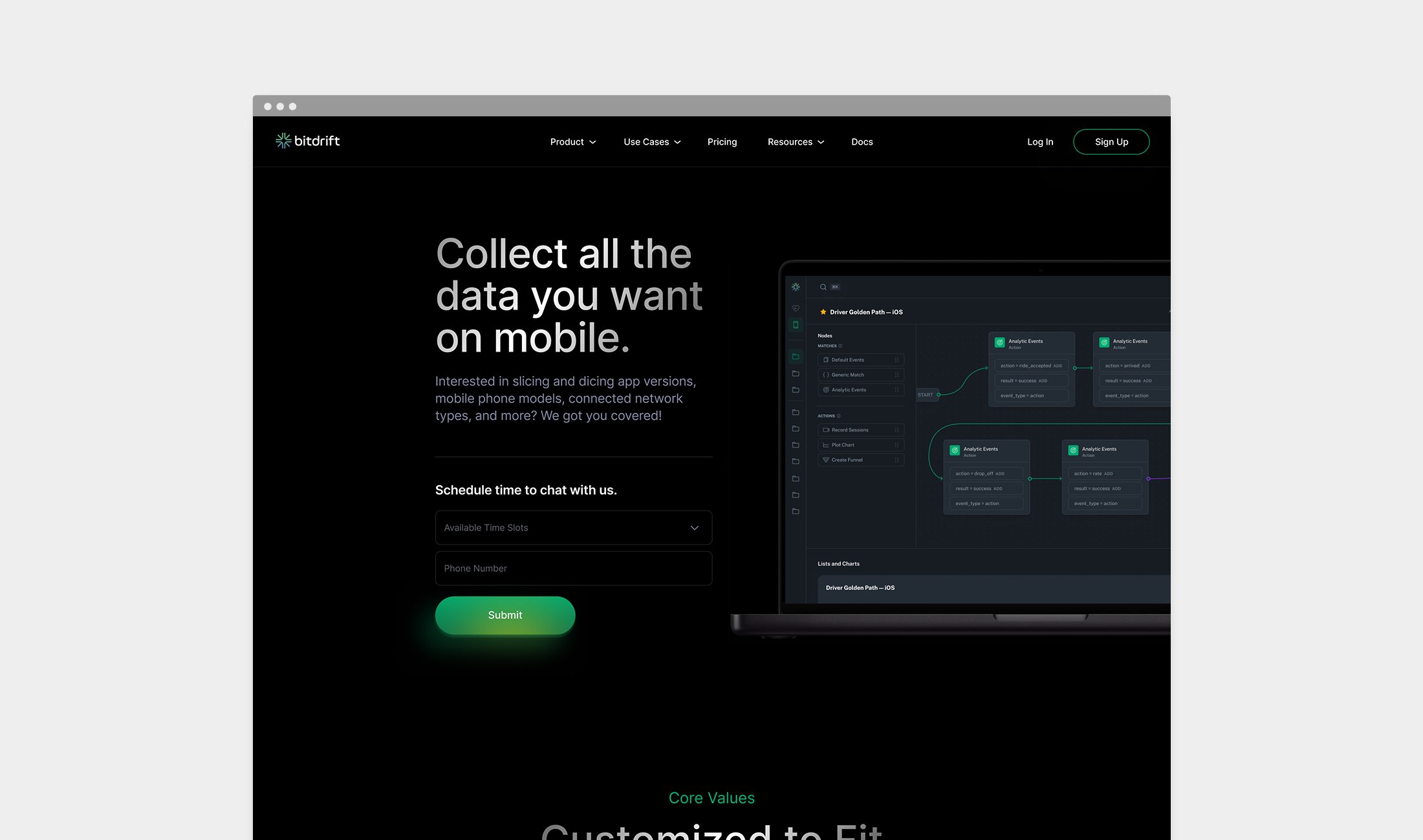
How does one approach designing a website for a startup operating in a highly technical industry?
1. Embed with engineering to deeply understand the product
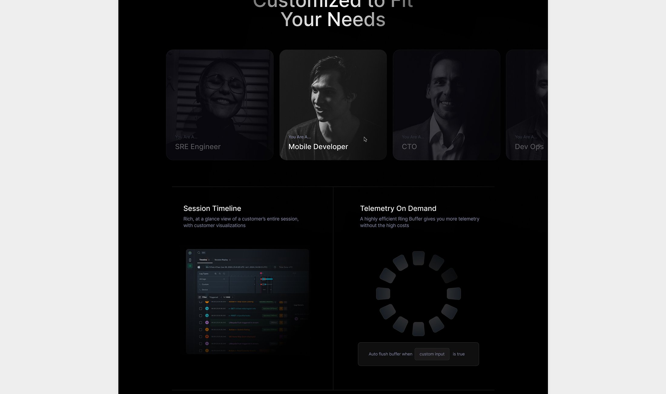
2. Identify the target audience—engineers and engineering managers
3. Pinpoint the unique value proposition
4. Prioritize precise, effective copywriting
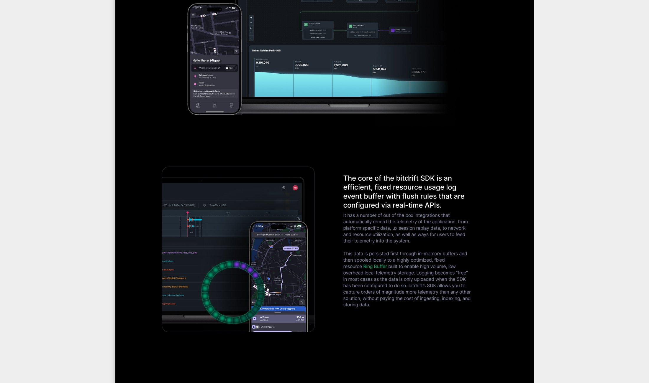
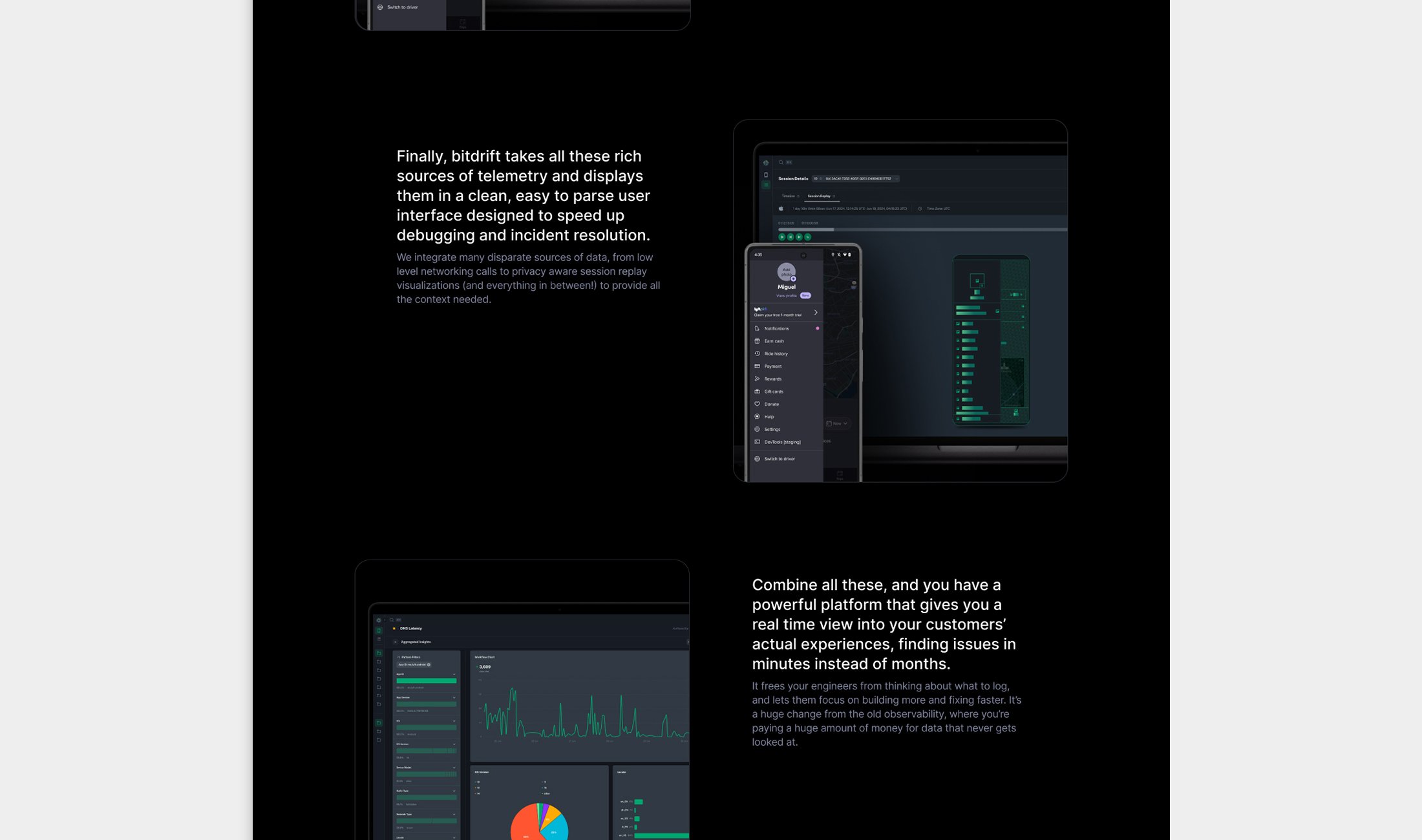
I directed a small design studio to help visualize the copy and chunk complex concepts into smaller, digestable sections. The goal was to translate technical jargon into accessible copy while maintaining credibility, make the technology approachable without oversimplifying.
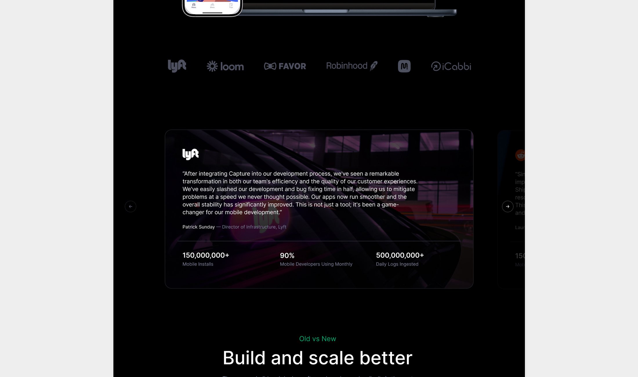
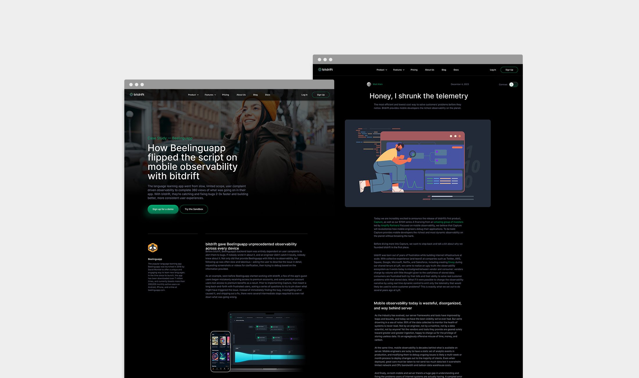
To establish our expertise in mobile observability, we dedicated significant effort to creating detailed case studies and publishing in-depth technical blog posts. We focused on sharing real-world implementation stories and their measurable impact to build credibility and foster trust with potential clients.
To support this content strategy, I designed the templates below to serve as the foundation for our case studies and technical blog posts, ensuring consistency, clarity, and a professional presentation across all our marketing communications.
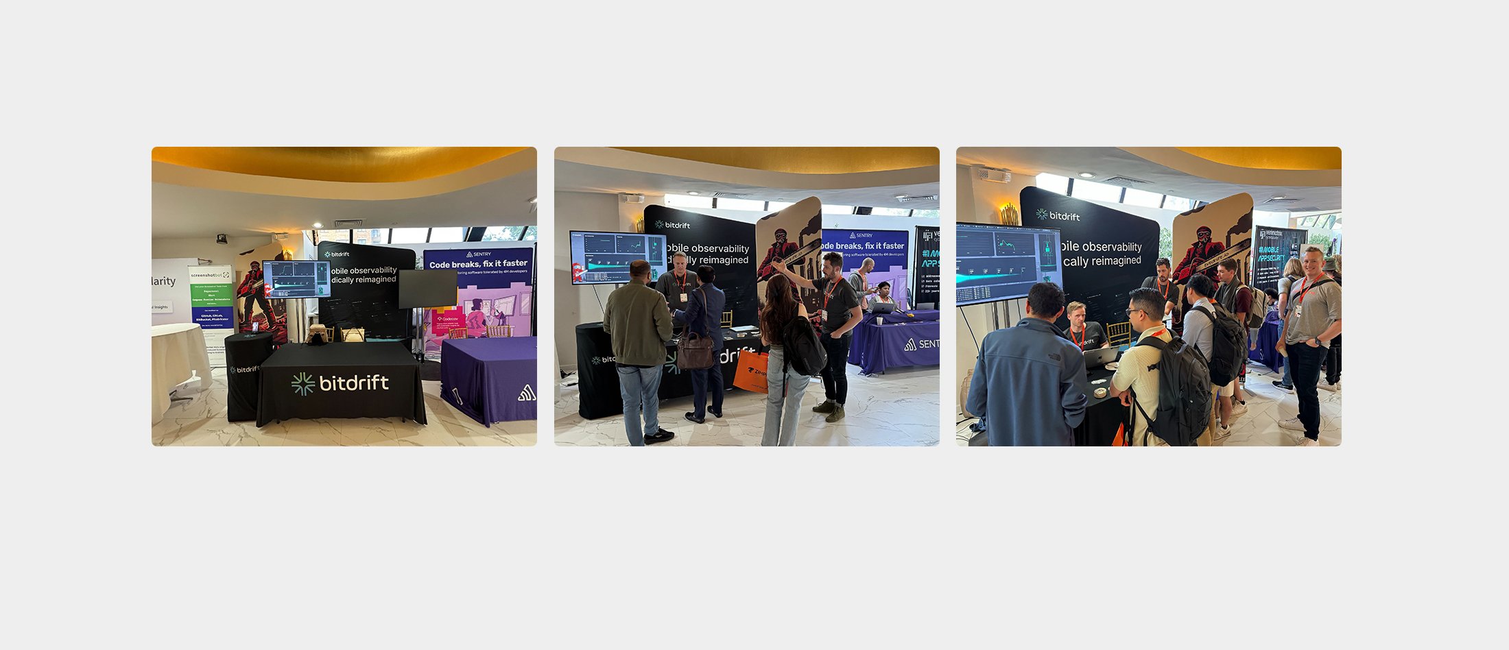
With limited time and funding yet to be secured, designing the logo and branding for Bitdrift became a practical necessity. The logo was crafted to be bold, scalable, and instantly recognizable, maintaining readability and visual impact across all applications, from digital platforms to physical assets. When it came time to apply our branding to our trade show booth at DroidCon, I focused on creating a cohesive experience— the booth featured prominent logo placement, a unified color scheme, and clear messaging that reinforced our brand story.